Creating Web Components
Table of Contents
Introduction
In this article, we’ll be building our own custom web components or HTML element. Web Components help us create standardized, modular, and reusable building blocks for our web applications.
Importing custom web component
In our HTML we can import it like so:
Web Components
<!-- Our own custom element import below -->
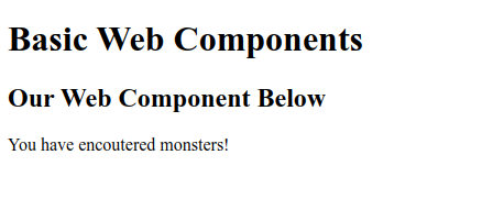
Basic Web Components
Our Web Component Below
<!-- web component -->
...
Defining custom web components & shadow DOM
In our JS, we don’t export the custom web component. We only need to run the below.
// The first parameter of our define method has to have a hyphen
'monster-encounters', Monsters
The shadowRoot variable holds the web component. The attachShadow method that takes in an object option and is like a sandbox container. This is what we call the shadowDOM. It serves to encapsulate and we can add css to it in particular. Below is a visual:

We are saying that our CSS styles applied to our custom component should not impact native normal elements of our HTML like div, a, and ul tags and so on, for example.
It is worth noting that some styles defined globally will be inherited (and cascade down) by our monsters-encounters component, like our color, font-size, font-weight, etc.
Using the mode: ‘closed’ argument just means that our parent (the DOM) can’t change or select (for example, document.query()) elements inside our custom web component.
Adding text here is a no-go!
If we we’re to modify the html to include content inside our web component, the above wouldn’t work because only our Monsters class can define the content inside.
Instead our html will show:
Working w/ slots to template (nest) content in our custom web component
If we want to include a list of monsters, we have to use the slot attribute inside the elements we want to nest in our custom web component.
...
Monster Types
Nymph
Bear
Stone Golem
Air Elemental
...
Above, we’re defining a slot attribute with a value of title and another with a value of list. Both have to be defined in our web component template used in our class.
Then, to include the changes in our template we:
template.innerHTML = `
<div>
<h3>Monster Encounters</h3>
<slot name="title">Default text if not title slot used in HTML</slot>
<slot name="list"></slot>
</div>
`
'monster-encounters', MonsterEncounters
// <monster-encounters>
We use the template element to declare a reusable HTML fragment. This can be cloned and then added to our DOM. That’s exactly what we do inside the clone variable in our Monsters class constructor.
Above we’re creating an HTML template using the template tag. We then define a div element with a heading and two named slots - “title” and “list”.
Ending Thoughts
In this article, we learned how to declare web components and use the shadow DOM to leverage modular and reusable design. Hopefully it has sparked some ideas on how to use them. Have a great one!