CSS Box Model and the Responsive Design
Table of Contents
As designers, we should be guiding the browser to do the heavy lifting of responsive design using css properties. We know everything in CSS is a box. However, the responsive design of our elements should be implicitly created to adjust to the content inside our boxes. While the positioning of our elements should be contextually derived, dependent on it’s surrounding elements. By the end of this article, you will be convinced of the power of CSS browser calculations pertaining to the box model.
Introduction
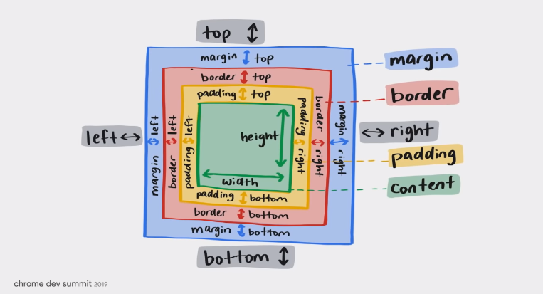
We know everything is a box in CSS. Where there exists an absence of something, we should assume it’s a box. Below we can see the old method for the box model.
The new method:
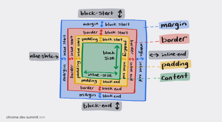
There’s always an evolving sense of progress in web performance and accesibility rapidly, so why should we care about this one? Well, because with the familiarity of this syntax (which isn’t just a mental model change) is used by the default user agent styles for elements in Chrome, like our p element or our ul element.
}
/* The same changes exist for our ul element */
}
Display Property
In our default styling, each element carries the display property. From our fundamental CSS knowledge, we know that block elements occupy all the available width or height, which is dimension dependent. I will first discuss block elements and then inline elements. In English, we write from left to right, and top-down. There is a property called writing-mode and it allows us set the writing direction. This property has the value horizontal-tb (horizontal top-bottom). In essence, the flow of our css styling because our writing direction is horizontal and has a top to bottom direction.
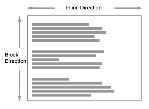
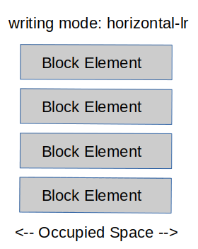
This is changeable to writing-mode: vertical-lr (vertical left-right). With this property you could modify the writing direction based on the language. Arabic is written from right to left, and top-down. While Mongolian is written verically from left to right.
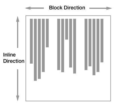
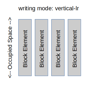
Inline elements (display: inline) do not take up the entire available space, instead they are laid out next to each other in a line. Core to this idea, is that inline elements follow the current context, flow direction, and writing mode. Inline elements are only permitted by default to be as wide as their inner content. The main idea is that block elements follow (flow) direction. Inline elements follow (inline) writing direction. This explains why we are not able to see any difference when we apply width and height values to inline elements. Inline elements behave by their rule of thumb: adjusting their size according to the content inside. The real value of this info is that inline elements can apply horizontal margin and padding values.
The diplay: none; property type removes the element from the DOM tree in the browser. There is an in-between of sorts. The display: inline-block; is the in-between for inline and block styling. With these properties, height and width are accessible values.
Demo of 'inline-block'
Flower market in Aix-en-Provence
Flower market in Aix-en-Provence
Sun flowers on the market
Flowers in the garden of the Villa Ephrussi
}
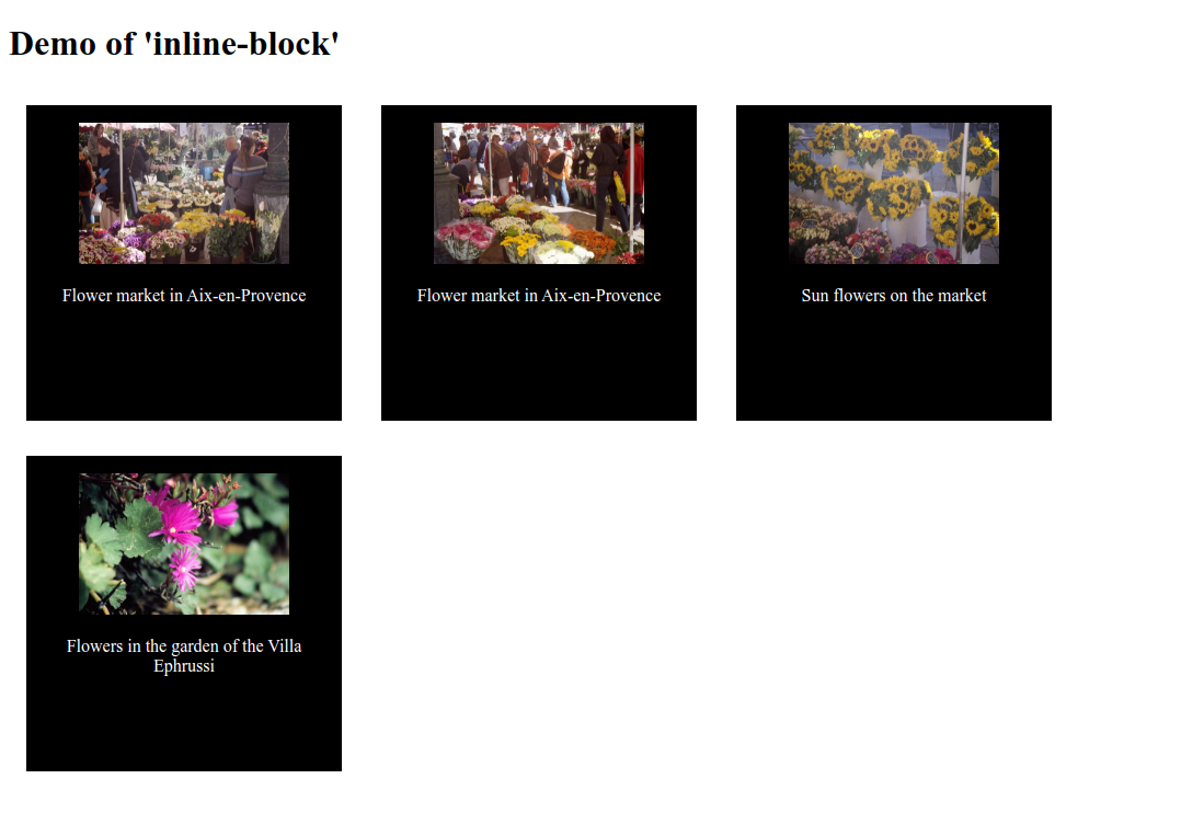
With display: inline-block our width and height values are applied in our grid-like photo collection.
Logical Properties
Returning to the English language, it’s normal for us to design thinking from a perspective of left to right and top to down. We live in an increasingly advanced and progressive world. Yet, we haven’t found a way to design strictly for other languages. Well, we have– but I only speak English and Spanish so the written content I consume reflects only direction: ltr (left to right) and writing-mode: horizontal-tb (top to bottom). So, is it normal to apply properties like, margin-right to create space to the right side of an element? Nope. Not at all.
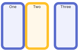
Let’s see why. We have three boxes labelled; one, two, three. Our styles look like this:
One
Two
Three
}
}
}
Our visual result based on the styles attribute we applied is:
If we change the writing-mode to horizontal-tb and the direction to rtl (right to left):
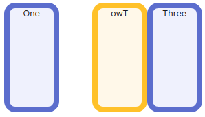
Then, if we change the writing-mode to vertical-lr):
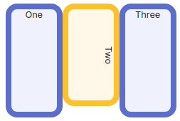
The practical implications of designing using margin-inline properties is that in a rtl direction, margin-inline-end behaves as we’d expect across languages that adhere to that direction. By applying margin to the end of the line. In other languages like Arabic, the margin-inline-end would be applied to the end (left in this case) side of the element because our writing direction is right to left.
Below is a visual of Arabic:

Formatting Contexts & Content Inside Boxes
Applying display: flex or display: grid for a <div> holds the value and doesn’t change it’s behavior with the display: block property. However, child elements under the <div> do change. Using only the display: flex property on the parent (div) element, the children will change their flow direction. The simple idea is: the child elements will distribute themselves horizontally.
For the most part, modern browsers are responsive via display: block and display: inline properties. display: block grows vertically and diplay: inline grows horizontally. This is a very powerful concept. We can use this to our advantage to create layouts that are responsive and flexible. It’s the reason why we can use display: inline-block to create a navbar:
Home
About Us
Our Clients
Contact Us
}
}
}

Box Sizing Property
The dimensions of a box are are responsive. The box adjusts it’s size to fit the content inside. With the box-sizing: content-box, we are including the border and padding values. For example, if we have an element that is 4rem wide, and add 2rem padding to both sides of the element (padding-inline-start and padding-inline-end), our element will be 8rem wide (4rem + 2rem + 2rem). However, if we were to use box-sizing: border-box, our element would be 4rem wide. The padding and border values are not included in the width of the element. The takeaway is that we tend to use box-sizing: border-box because it eliminates information that we don’t need to know. box-sizing: border-box makes predicting the width or height of an element easier.
This is why in our reset css file (to bring consistency to browsers), we have:
}
Changing this property will then be intentional, adhering to the concept core to CSS cascading.
Overflow
When an element overflows it means that the content inside the element is larger than the element itself. Overflow can sometimes happen when we have a fixed width or height property inside a child block-level element, with the parent being a block-level element as well. Enter: exceptions to the box-sizing: border-box property.
For example, let’s say we have a block element inside another block element and we use box-sizing: content-box with a padding value of 2rem in the child element. Then, we apply inline-size: 100% to try and make this element fit the parent container. Now, our child element will be larger than the parent container. This is because the padding value is included in the width of the child element when we use the box-sizing: content-box property.
Child element
}
}
}
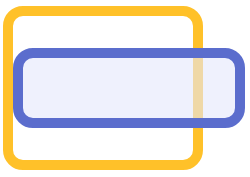
Our inline-size: 100% property is actually saying “make the child element 100% of the parent element’s width”. This would be the equivalent of width: 100% in a horizontal-tb property with a value of writing mode. But because the padding value is included in the width of the child element, so in reality it becomes larger than the parent container by 4rem (2rem + 2rem).
If we remove inline-size: 100%, then our child element will be the same width as the parent container. We could choose any box-sizing property-value pair and it would consistently work.
Ending Thoughts
The big picture idea of these concepts practically is that the dimensions of our elements should be guided to be responsive by shrinking-stretching themselves according to their inner content and our layouts re-addressing their positioning according to their outer context. As designers we should be guides to the browsers. I will distill and discuss more in future articles.