CSS Cohesion!
Table of Contents
Our CSS should try to be as cohesive as possible by adhering to the design Principles of Gestalt. Gestalt helps us to understand how our eyes perceive the world around us and how we can use this knowledge to create better designs. These guidelines help us simplify, organize, and create a more unified experience for our users.
Introduction
Who is this Gestalt anyway? Well– it’s not a person, instead founded by three people. In German, the word means “form” and the theory behind Gestalt describes how our minds extrapolate and transform seemingly random structures into realible “forms”. This could explans why clouds sometimes appear to form faces. The theory was founded by three German psychologists during the 1910s and ’20s; Max Wertheimer, Wolfgang Kohler, and Kurt Koffka. Below is a cheatsheet of our principles:
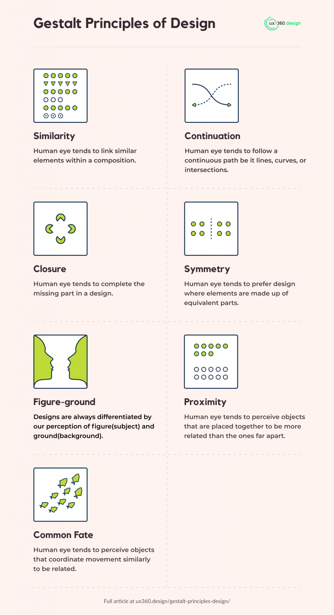
The focus is on two principles. The Gestalt Law of Proximity is the idea that objects that are close to each other are perceived as being related to each other. In a newspaper, this law is implemented by grouping together related chucks of information together. While, the Aesthetic usability-effect is the theory that people perceive more beautiful things as being more usable. This can be implemented in a newspaper by using cleaner, more attractive designs and layouts. These propositions serve as a backdrop to create unity in CSS.
Creating Cohesion with Modular Scale
Our designs adapt to the content inside our box-models. Since we primarily communicate through text, our designs should use the line-height property to create whitespace for our designs. For example, a font-size with a value of 1rem and a line-height of 1.5 gives us a total of 1.5 rem as our value. The Modular Scale helps us direct effort to the Similarity Principle of Gestalt by using increasingly similar relative measurements to create whitespace for our compositions.
1 // 1// 2// 3Modular Scale with Custom Properties
To employ modular scale in our designs we can use CSS custom properties. Using our calc function, we could create variables that calculate the appropriate values to work with using a default or base ratio.
}
Our --s3: calc(var(--s2) * var(--ratio)); is multiplying the custom variable --ratio four times. We could also accomplish the same with the experimental pow() function.
), 4);
The above is multiplying var(--ratio) four times like before.
Typography for the Web
Physical print media is static and not responsive. To create cohesion, we can take some ideas from this medium that carried over. For example, we can creates whitespaces in these areas:
And create columns in these areas:
Using ch as a measurement is rational because in a newspaper, we are adapting our page to the text content and displaying it in columns. Our ch unit is also responsive, because it inherits the value of our rem and adapts to measure the 0 character as our rem grows or shrinks. Adhering to this principle with our flow elements in our global styling would look like this:
}
With the new content categories in our HTML, we have to choose elements that work with text. This would mean categorizing our css selectors to choose elements designed for text.
Block level (vertical) elements shouldn’t takeup any max-inline-size value because they would automatically grow to the max available width (in our case 60ch). Our inline elements usually represent text, and setting this property would go against the principle of building CSS and utilizing the natural cascading nature of designing with it. An improvement of our previous CSS would be:
}
}
Above, every element that would otherwise not need a max width of 60ch is ignored because those elements would automatically takeup the full 60ch (width) available to them.
Ending Thoughts
Overall, following the design principles of Gestalt and elements of typography can help us create more cohesive and unified designs. By understanding how our eyes perceive the world around us, we can create designs that are more easily understood and function more effectively.