Styling Web Components
Introduction
In this post, we’ll learn how to style our web components. Checkout my previous post on how to create them.
Styling web components
As with our css declarations for our HTML, we have access to different css methods and properties.
We’ll start with our completed html and javascript solution to creating web components from my last post, except now we’ve added global styles.
Web Components
<!-- Styles -->
Style Web Components
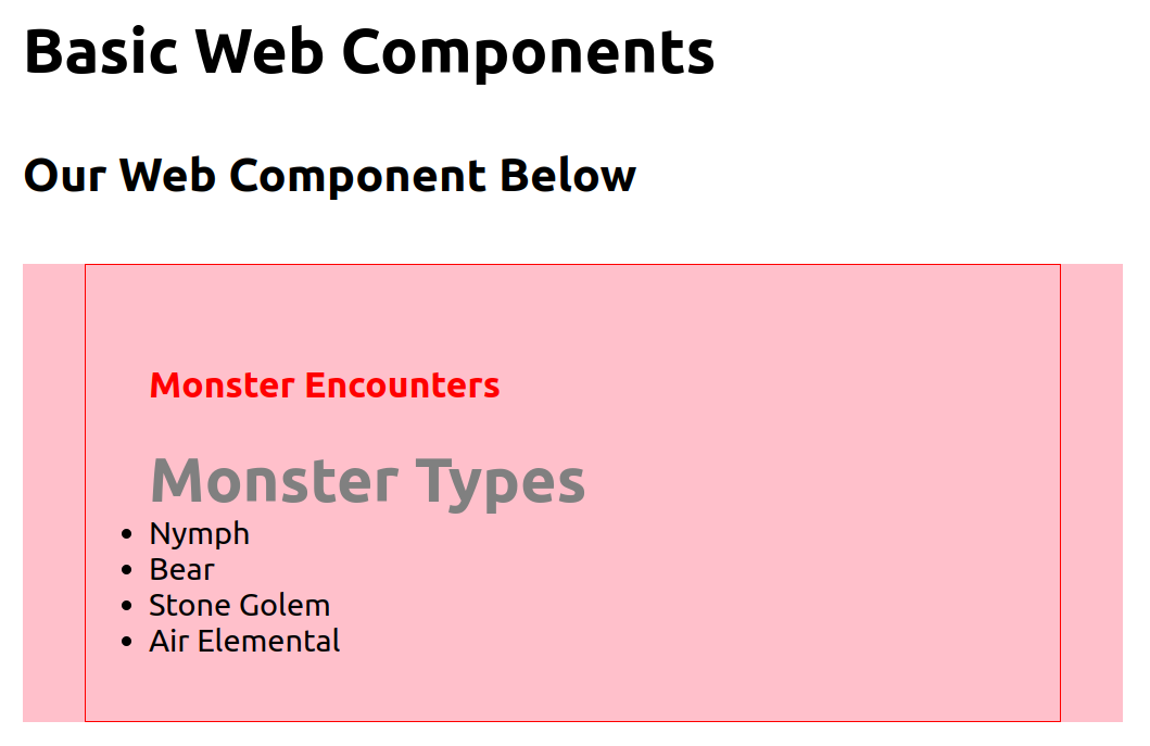
Our Web Component Below
Monster Types
Nymph
Bear
Stone Golem
Air Elemental
/* In main.css */
}
}
}
template.innerHTML = _
div
h3Monster Encounters</h3>
<slot name="title">Default text if not title slot used in HTML</slot>
<slot name="list">/slot
</div>
_
'monster-encounters', MonsterEncounters
// <monster-encounters>
Properties and selectors
When we style our custom web components, we have access to different css selector and properties. To add styles to our template, we can use the style tag because we’re working with plain html, like below:
template.innerHTML = _
style
/* @import url(); */
div
:host
:big-bang
:host-main
::h3
/* In our case, applying properties to slot wouldn't work because the slot is itself being replaced by the h2 variable. It overrides it.
slot {
}
*/
/* Part wouldn't work with out current code. Although it works by referencing the attribute allowed by template in our main.css. Just like with slot below in our HTML, it would be declared the same way, except we would reference the part value (**(::part(VALUE_HERE)**) in the external css from where we want to apply our styles to.
::part(){
}
*/
h3
</style>
div
h3Monster Encounters</h3>
<slot name="title">Default text if not title slot used in HTML</slot>
<slot name="list">/slot
</div>
_
Above, with @import url() we can build a component/theming system of stylesheets and import those to this component. Say, if we needed a common stylesheet for a standard every one of our components need to adhere to because they need a common look and feel.
Our :host selector lets us add properties to the shadow root itself. We have to include the display: block; property because without it, our elements are inline and won’t show. The :host selector lets us add properties to a specific web component, we need this if for example we have many components. host-context selector lets us add properties to the parent container of the current web component we’re working with, in this case we’re making the color red. It’s worth noting that :host and :host-context have the same level of specificity in our declaration. So whichever one is placed last, will be applied. In our case, background-color red.
With ::slotted(h2), we can add properties to the slots inside our web component. In our case, it’ll be h2. For the second property, our color value is being overriden by the parent color value penetrating through our shadow DOM from our main.css file in the beginning. Only a few properties are subject to do this. So we override those with important.
Below is how our simple Web Component will look:
Ending Thoughts
In this article, I discussed how to style web components for theming, the different properties and selectors available to us to style in our shadow DOM, and the style declaration precedence with some web component selectors. Hopefully, it has brought some more understanding of how we can use it to create a design system. Have a great day!